
lots and lots and lots of dimensions …. :)

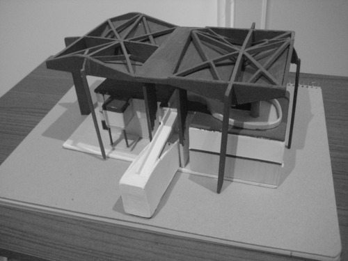
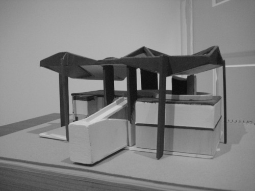
A little while ago I completed a period of work experience with architectural firm, Durbach Block. The company is known for their Balsa wood mock up and presentation models of residential and commercial architecture which they fondly present to clients. I was given the task of completing (in a few days) a Balsa wood model of the Centre Le Corbusier to present to them at the end of the stint. The images above are of the mostly completed model which they were thoroughly pleased with.
Neil Durbach, part owner of the practice, commented that “many people simply end up presenting a pile of sticks to us at the end!”
During this period I also had the privilege of site inspecting the half - constructed Roslyn Street building which the practice also designed, accompanying Neil Durbach and two others. It was a fantastic “behind the scenes” look at a fantastic piece of architecture loosely based on the designs of Antonio Gaudi.

This website I found a little while back is shaped in the form of a blog, and presents articles on how to make and design items “cheaply.”
I found this article (http://www.vvank.com/09/make-a-muji-wall-mounted-cd-player/) really fascinating, which shows how to create a Muji wall mounted CD player from a few spare materials (I have not attempted it yet). Maybe you could give it ago and send / link some pics to this blog??
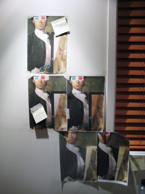
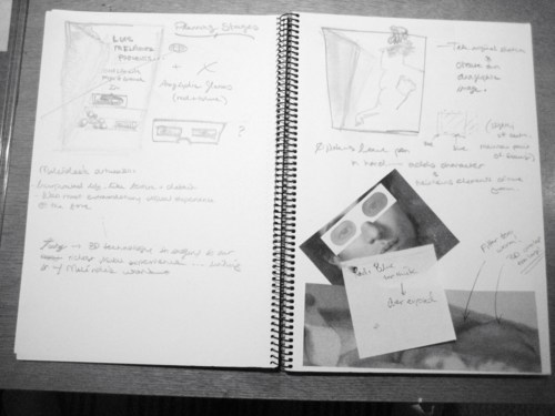
Below are photos of some of many workings that went into the design of my poster mash - up. The images taped to the wall were to keep record of how the colour changed (cool or warm) after filters were applied or adjustments were made. This way, previous experimentation could be used as a semi - reference to the work currently being done on screen.
Although we completed this assignment a while back, here’s some other images I was considering for the poster mash - up:
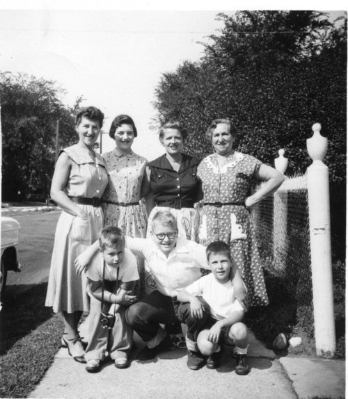
A 1960s family
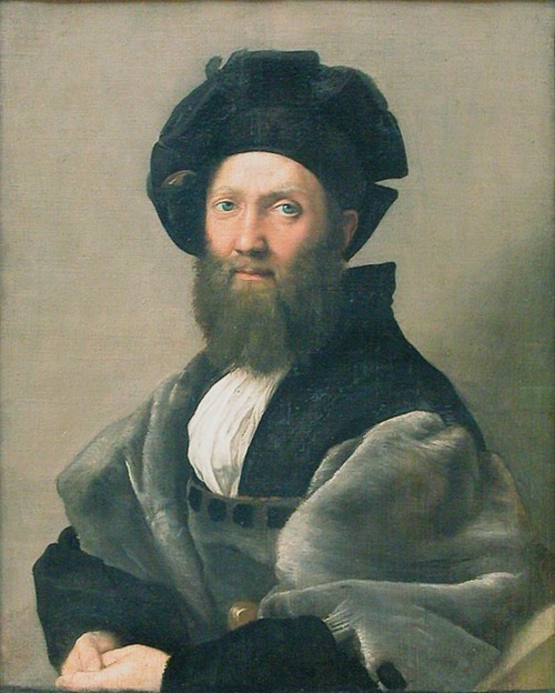
Baldassare Castiglione

It was great seeing the whole group put together our (whole) colour wheel today! Many of the pieces were really successful, but one thing was definitely learnt … uniformity amongst the group. We didn’t fully consider how the gradation of each colour would be displayed, resulting in many varying gradient designs.
The Prussian blue segment above was completed by Rainbow and myself, made completely of magazine cut - outs :)

The Campana Brothers / Powerhouse Museum exhibit poster :)
This poster was designed to exhibit the raw elements and nature of the Campana’s work, and the chaotic, flamboyant city that surrounds them. Orange was palette smeared over a water colour page, then “beautifully mounted” on stiff card. A thick woolen thread in purple and white was then weaved through and over the board in a design representative of their crafty free - form attitude to design.
The black freehand ink type was included at the base of the poster to once again reflect the chaotic, unplanned and flamboyant nature of Sao Paulo, and the Campana’s work, which derives from this.
Comments!
Rina: Went to a lot of effort, more of the thread in varying colours may have been better (with white background), and text was completely wrong
Mal: Text could have been white instead of black, and reduced to a single line … otherwise good :)

My poster mash - up design!
The main image is a Self portrait of Luis Melendez, a painter famous for his amazingly life - like paintings of fruits, vegetables and household grocery items. Scholars of the time say he spent more time adjusting light settings and fixing shadows than mixing his paint palette!
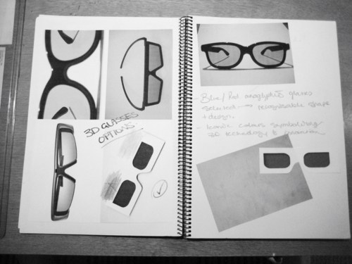
In 1747, Melendez’s artworks were considered a high point in realism and life - like accuracy. Today, the pinnacle of realistic representation and imagery is the use and enjoyment of 3D technology. Through this link, Melendez was brought into the 21st Century, and aspects of the image were adjusted to fit accordingly.
Not being able to find 3D glasses photographed at the right perspective, I made the glasses myself using layering and shape techniques in Photoshop, and the 3D effect layered on his original sketch is another of my techniques.
In the end, I think the image turned out rather well.
The above title is the name (Visual Acoustics: The Modernism of Julius Shulman) of an absolutely amazing documentary on the incredible photographer Julius Shulman. I saw the very short teaser video of this on Wallpaper last year and bought it from SBS straight away. It’s predominantly architecturally focused, as Shulman was an architectural photographer, but the intensity of the film, the details of his life that they capture, and the dramatic influence his photographs had on the careers of Architects of the time (Gehry, Wright … ) enthralled me completely. I walked away from it having a completely fresh outlook on aspects of design … just stunning!
Please do check it out if you get a chance … or better still, buy it!! :)
So this may be a little out of order, but just wanted to introduce myself :) My name’s Robert but Rob is just fine. I have a strong interest in Architectural design, which carried me through my Major Design Project for Design and Technology, and was nominated for the DesignTECH exhibit earlier this year. That said, my interest extends to all aspects of design, art and music especially.
Music, particularly minimal techno, has played a very important role in my life since around 2006, where I decided to be creative and design my own independent music label as a “hobby” … little did I know that now, 5 years later, that project has morphed into something quite amazing …
Apart from this, I like to cook and love driving around with friends.
My favourite designers to date are Le Corbusier, Achille Castiglioni, Philippe Starck, Garth Roberts and Antonio Citterio. There are some really great independent artists as well, that may not be superstars, but also produce some amazing works around the world.
I believe that this Industrial Design course will provide me with a broadened and detailed knowledge of design, designers and processes involved in the successful creation of a form that one or many can find useful, or simply enjoy for a long period of time!

I’ve been following this guy for a little while - he’s an industrial designer named Joey Roth, and has created two really beautiful products. I was kind of obsessed by his ceramic speakers and the clever use of harmonious materials in their construction, so much so that I though of buying a set. Though, after reading some blog reviews online about their audio quality and frequency, the price far outweighed its sound capabilities unfortunately.
Lovely design work though!
website: http://joeyroth.com/
If you’re ever curious, Etsy online has some really nice handmade items for sale. Although some of things there aren’t what I like, it’s a great place to explore and see what others have come up with. Also, if you scroll down the page, they often feature a designer or company of the week with an accompanying interview.
website: http://www.etsy.com/
The train trip home was a prefect opportunity to listen to a few podcasts of the “By Design” show on ABC Radio. There was one that was particularly interesting and focused on the effort that wine makers go to in designing, or contracting a design for their bottle labels. Graphic design and art now has a huge impact on the sale of wine bottles, and at times, is what acts as a point of difference and a competitive edge over the rest of the competition.
Also, in expanding through innovation and creativity, concepts and prototypes, as well as currently released products are changing the way we think about alcohol packaging. Examples include a single serve glass of wine in a clear plastic cup, with a foil “peel - off” lid, a thin vile design that can be slipped into a pocket, and dehydrated wine for those camping out and about.
Also, they were discussing whether or not the design of the wine glass has a significant impact on the taste of the wine, and concluded … it did?! Apparently, the whole sensory experience of how the glass feels in your hand and the way the aromas move around internally play a vital role in the end taste experience. Pretty amazing!

I absolutely love the “Palm Springs” minimalist look in Architecture and design. It’s amazing how unique architects and design personalities such as Richard Neutra, Charles and Ray Eames and Craig Ellwood all contributed to a Case Study House Project.
Buildings such as the Kauffman House and Case study House #22 are such rare examples of beauty through simplicity and explicit planning, and the outstanding use of raw and natural materials on sight incorporated into a very linear pavilion - style dwelling!


