Wednesday 19 October 2011

Bill Moggridge Response

Bill Moggridge’s inspirational speech on design really highlighted how broad the field of design is, and made these ideas accessible to the general public – people both in the design field and those who are not. His quote, as many have previously stated, that “everything is designed” really brought home the fact that when it comes to design and the creation of a new product, or even the re-design of an existing object, possibilities are really only limited by one’s imagination. Furthermore, for those who do not understand design, it is ever more important for us as Industrial Designers to work towards products that are “clever” in their form and interaction with the end user – if something is designed right and is comfortable to use, it should appear that little design was done at all to get to that stage, and that pure enjoyment or ease of use results.

Moggridge also emphasises that the designers are in demand more now than ever, which is a fair statement as our world progresses into the future and tight competition between technology and innovation brings designers to think harder about systems interaction and user – friendly devices that blend into our at times over – scheduled lifestyles. With technology specifically, we are progressing from the stage where it controlled our lives – now we are starting to control it, much of the credit due to good design and innovation.

I believe that this short presentation is a must see for designers in any field, and also those in the general public. It re-confirmed why I chose a path in the design field, and helps those who do not quite understand the concept to grasp a basic understanding of what thinking goes on behind the scenes of their favourite consumer item or technology piece – in many cases, it’s not just one guy behind the desk whiling away ideas until he strikes it lucky, its team work and networking that makes design what it is today. 

Tuesday 18 October 2011

Commented on the following blogs:


Cutting Diagram

Rationale: Threads Pendant Light Concept


My ultimate aim for this project was to create a sense of simplicity and delicacy through the design of a pendant light. The pendant was preferred as it in its form is simplistic, hanging from (at bare minimum) the singular power cord that illuminates the bulb, and dismisses the need for stands, supports or complex additions. Going further, there is a whimsical nature about pendant lights and the way in which an illuminated source hangs freely and responds to the movement of air around it, glowing at or above eye level. This freedom and movement brings beauty that other light forms cannot replicate in the same way.
The initial concept designs for this project were heavily focused on exploiting forms and designs that could be achieved through circles. This began with circles manipulated to create closed in cone masses and cylindrical interlocking forms, though it was apparent that these could not be duplicated using the polypropylene material supplied by JCDecaux.
From this, an exploration into circular rings began and a flat – packable pendant with three folded and interlocking rings demonstrated the sense of simplicity and delicacy that I wanted to achieve. This design, although promising, was discarded after being test – made at 1:1 scale in polypropylene.

The final design is an expression of simplicity and delicacy that celebrates the natural movement and flow of the recycled polypropylene material. Rather than forcing the material to do too much, the design was stripped back to a basic planar form (1 square sheet of polypropylene) which was slitted to create texture and interest, as well as to let light through. Two custom designed and integrated C – shape holdings were also thought into the concept to allow the shade to be fitted to the light source. Although a clear halogen bulb would have added to the pendant’s overall aesthetic, the difficulty in finding a mount that was not chunky or bulky made this unachievable. This said, and in keeping with the theme of recyclability and ecologically sustainable design, the warm fluorescent globe chosen was a sufficient option.

In terms of packaging, the pendant was chosen to be packed in a mailing cylinder for two specific reasons:

1)      The cylinder would enable the sheet of polypropylene to remain curled in one direction – an essential part of the design which, when assembled, allows the fitting to hang curvaceously and splay at the ends
2)      In terms of transport and shipping / storage, the cylinder was the most efficient space – saver, and allowed for greater volumes of the product to be transported at once had it been mass manufactured. In the long run, this would also reduce transport carbon emissions.

Also, in order to keep the design in one piece and aligned until the user is ready to display it, the design remains contained within an outer “frame” of polypropylene, which can be popped off similar to that of a jig-saw puzzle piece, loosely secured by threads of the material that have not been fully sliced through. 

Wednesday 14 September 2011

Blogs that I have commented on:


http://camillekordek.blogspot.com/

http://rainbow-tam.blogspot.com/

http://darkblender.blogspot.com/

http://vindustriald.blogspot.com/

http://pings19.blogspot.com/

Tuesday 13 September 2011


The cheese grater has always been a rather utilitarian object where a large stainless steel grating plate is the dominant feature of the design. Often, existing designs attempt to cater for a number of grating circumstances, crowding or overcomplicating the device. This, in addition to poorly resolved handles and uncomfortable grips has lead to a number of functional, though cumbersome grating devices.   

My design explored the possibilities of creating an entire enriching situation through sharing, presentation and dining, and focused on elements of symmetry, a sense of purity and entire user engagement with the hand tool. A significant change in the grating surface design and proportion was fed by the intended use, and the particular cheese that the design was honed towards.
Specifically tailored to Parmesan cheese, the user removes the well weighted milled Aluminium grater from its housing, hollowed out from the shapely Kauri Pine base. A subtle domed top and groove imply a separation between device and handle, and define the way the grater should be held. Fine grating perforations were chosen to suit Parmesan’s firmness and fine light shavings that result, and the overall shape was kept to a circle that traced the circumference of the handle, lowered slightly and reflective of the shadow cast by the handle.    

Responding to the base plate, the design tapers to a delicate tip which allows the cheese to cantilever over the dining table when resting. The overall design is somewhat reflective of oriental craft and bowl carving, though the shape was influenced by a waiter’s arm movement as he or she presents ordered food to the customer. In the same way, the base offers the condiment to its diners to take and use. 

Monday 15 August 2011

My Design Career


Initially during primary school I had always been concerned with trying to perfect a situation, or tweaking things to make them better somehow. I remember “designing” book covers and creative posters for work in class, avoiding common plastic coloured wraps. In high school I thoroughly enjoyed and excelled in the compulsory art class in year 7 and 8, and from then on aspects of design began to filter through all things that I would do. It was really in these younger years that through browsing and research I became aware of design, though I had no real understanding of the meaning behind it other than that it was beautiful. Architectural design and interiors really began to click and I found that my interest and love for this aspect just grew as I progressed through school.
In year 10, I continued to complete a Visual Arts class and it was in the same year that I also did 2 weeks work experience with Hassell Architects and Durbach Block, meeting chairman Ken Maher (for Hassell) and Co – owner Neil Durbach (for Durbach Block). Conversations and involvement with them really broadened my understanding of what design meant and how and why it is articulated as such.
Later, I finished year 12 having done Design and Technology in which I completed a major design project where I designed an environmentally sustainable house for a beachside location. This was nominated to be presented at the Powerhouse Museum earlier this year.  
When I first applied for uni I knew I wanted a career in design, and Architecture or Interior Design were my first options for study. Due to missing the higher cut – offs I accepted the offer into Industrial Design.
Apart from design, I also have a strong passion for and appreciation of music, and I would really like to somehow incorporate these two aspects in my future career – not so much as to design musical instruments or equipment, but to design spaces, experiences and environments that immerse individuals and stimulate them. Pleasure and company are essential to life and I think there is real potential to explore these mediums further and create something amazing!
Besides this, I also very much love the design work which is done incorporating delicate materials such as porcelain and glass with heavier or denser highlights and features of cork, woods, metals or natural fibres. I think this combination of raw and refined, delicate and dense is a beautiful exploration of form and, to some extent, function, and would love to be a part of this in the future.  
Currently, I’m enjoying aspects what Industrial Design has to offer and have learnt much in the time that I have been here. I think one of the most important things I have learnt is that today the environment plays a large role in the way we design and have to consider design. I think that being resourceful and environmentally conscious also presents new opportunities for design, and a unique chance to create something more.

Product Sketching


Monday 8 August 2011


The poorly designed power adapter for an external hard drive device (sold in Australia). The large tabs on either side clearly indicate that this is where you grip to remove the head of the adapter, although when tugged at, the head does not come off. Instead, and only after further detailed investigation, a small black button is found hidden underneath the lip of the device - half way down the adapter.

This activity allowed me to consider the elements of good design, and how these should be clearly conveyed to instruct the user on how to operate the device without difficulty. 

Sunday 31 July 2011

Design Excellence: Philips Fidelio DS9000 Docking Speaker


In an over - saturated market of iPod docks and docking speakers, I was surprised at the quality, detail, and beauty that was achieved in the design of this product. Philips were treating the docking system as a new sort of "exclusive product," and dressed it accordingly with a rich timber shell, sensuous curves and chrome highlights.
Using this process of product form analysis, I learnt a lot more about the design intent of this technological product. Often we are bombarded with the technological features and aspects of the design - and this one was no different - though, in observing the form or the object, an insight was gained into the designer's intent, and how he perceived a music device should be shaped and presented in 2011.

Thursday 28 July 2011

Annie Leonard: The Story of Stuff


The Story of Stuff is essential viewing for any in the design industry, especially industrial designers. Although simple in its approach, it conveys the important ideas and values of recyclability, renewability, forest regeneration, government intervention and design for prolonged use which we must consider when it is our turn to create a new object and release it into society.

 As Leonard emphasises, gone are the days where products are designed just for pleasure, entertainment or constructive use. We, as designers must delve much deeper to plan out the experience and life which encompasses the product, and how it will be used to its obsolescence. Yes, this may take more time and thought, thought the results that are achieved outweigh all this.

The Story of Stuff provides a short, punchy insight into how the environment, economy and consumers respond to “stuff,” and acts as a great reminder to us all about factors that we become complacent with and tend to forget during our day to day lives. I was amazed at how small a number of toxic chemicals were actually tested before use, and that many of them have not been tested in partnership with one another to see what the reaction would be.

Also, something that was interesting and slightly disturbing was the fact that some pillow brands were using neurotoxins to improve its flame – retardant qualities. Although my current pillow is mad of natural components, I will definitely be looking out in the future to avoid purchasing such goods.

I’ve always shunned the idea of planned obsolescence, a concept introduced to me while I was studying Business at school last year, and frankly do not see its value in our world today, or any time previously for that matter. It makes you wonder how, after such true and convincing evidence that our resources and state of living is in decline, people and industries maintain the same work and production ethic, holding a blind eye to it all.

David Kelley: Human Centred Design

I think that there is real merit in understanding the ways a human interacts with a product and vice - versa. In an age where technology is leading innovation, it is essential that designers continue to employ the human being as the central focus.

In his 2002 TED talk, David Kelley presents a number of interesting case studies which help to explain the human centred nature of product design which has been evolving through the past 18 years. More as a prediction of what was to come, Kelley’s ideas were somewhat forward thinking at the time, concepts which we see incorporated in design extensively today.

He presents work completed for new Prada stores which are focused on creating a more immersive and engaging experience between the consumer and the clothing item he or she chooses. This includes bespoke RFID tag remote controls that can capture the clothing data and present it on screens displayed around the store. In conjunction with this, scanners in the changing rooms collect and present information and detail about the clothing items that were chosen to be tried on. Another interesting feature was the use of liquid crystal glass screens which turned opaque when a floor button was pushed. I’ve seen this technology now moving into the domestic environment, chosen as a unique was to achieve privacy and maintain an open – plan – like space.

In collaboration with Scott Adams, Kelley was asked to design the “ultimate cubicle for Dilbert,” and through the explanation of this process it was reiterated that a human engages more deeply with a product that can give something back – a pleasurable feel, appearance, an emotive response or recognisable action. Furthermore, although sometimes perceived as kitsch or dated, it is the personal items which, when used to accessorise the design, actually transform a cubicle space into a more user friendly environment – items that are recognised and have treasured value.

From this talk a lot can be taken away, though I believe the two most important factors are that humans form natural attachments to items of value or significance, and that an item needs to be engaging, designed with the human as the central focus.   

Wednesday 20 July 2011

Don Norman - Emotional Design

Watching Don Norman’s TED talk, an insight was gained into the way in which humans react and interact with objects and situations in everyday life. Focusing on products, Norman reiterates the importance of Emotional Design and how it can be effectively adapted to engage consumers with products. He splits Emotional Design into 3 sub – categories: visceral, behavioural and reflective, of which visceral and behavioural are subconscious responses to stimuli.

Norman presents a great example of visceral interaction with products, explaining how people often reuse glass bottles and wine bottles to display flowers or fill them up with another liquid - proof that the bottle and its content was not solely purchased for the content inside as with other grocery or consumable items, but because of its perceived beauty.

Interestingly, Norman raises a point about how pleasure through specific product design can sometimes dampen the impact of poor functionality, and uses the E – Type Jaguar (now exhibited at MoMA) as an example. This may be the case with some product design where beauty domineers, but I personally believe that there should be equality between functionality and beauty in design.

Besides this, it was interesting to learn that the “happier” we are feeling, the more abstract our thoughts and thought processes become – a valuable asset during brain storming sessions. Contrary to this, anxiety also influences our thought patterns, enabling strong focus and rational thought, useful when under time constraints or deadlines to complete tasks.   

Ultimately, what I took away from this talk was how strong bonds and emotional responses can be formed between humans and products, and the importance of implementing elements of “fun” and enjoyment in design. Emotional Design, now more than ever can make or break a product. As well as functionality, image and ego (reflective responses) also play large roles in the success of a design and must also be taken into consideration.

I believe designers are looking to create a unique “experience” through consumer interaction with their product, and no matter how subtle or empowering this experience may be, it can only be achieved with an understanding of human behaviour, and emotional response.

“So Jake Cress is this furniture maker,and he makes this unbelievable set of furniture.And this is his chair with claw, and the poor little chair has lost its ball and it’s trying to get it back before anybody notices. And what’s so neat about it is how you accept that story. And that’s what’s nice about emotion.”

 I chose the quote above as the most outstanding as it demonstrated the effect of emotional response in a live audience as they viewed the piece of furniture on the display. Laughter began even before Norman began speaking and it was clear that the audience had understood the playfulness achieved by the designer.   

Thursday 2 June 2011


Passport Review

This had already been documented in writing, but to keep up with requirements, here goes … 


Museum Visit / Exhibition: MCA Sydney, in which I saw the Annie Leibovitz photography exhibition. 


Read and Comment on a Design Blog: “Designer Dan” & “Life is Carbon,” to which I read and commented upon the “Life is Carbon” article on Louis Campbell - his designs of past and present including the “Very Round” chair for Zanotta.


Read and Comment On Another Students Block: I had, by now, read through all of the design blogs present on the “Past Present Futures” design blog. I attempted to answer a question raised by Luke Messina and did the same for Cherrie. 


Read 3 Design Magazine’s / Journals: 


- Wallpaper Magazine 
- Habitus
- Abbitare


What Was of Particular Interest? Habitus and Wallpaper had great articles on the changing design in kitchen utensils. The design aesthetic is slowly transforming from a sterile, clinical form to featuring timber, cork, stone and natural fibres, making these objects kitchen display pieces.


Completed the Elise quiz!


Visited the COFA Library in an attempt to borrow the only copy of “Campana Brothers: Complete Collections So Far,” though the book was on loan for a little while … I bought it at MCA instead :)


Listen to An ABC Podcast: There was an interesting story the wine industry and the way in which art and artists have been contracted to feature on labels and packaging for bottles. New and innovative serving packages have also been developed which include a single serve plastic cup with foil sealed lid and a vile containing a single serve of wine that can be pocket - stored. Campers have also been considered through further development and manufacture of “dehydrated wine” hmm …


Watch a TED Talk: “Steve Jobs - How to Live Before You Die” 


It was interesting and rather uplifting to gain words of inspiration from the Apple billionaire, rather than hearing more on his product range or technology. His words were really relevant to all aspects of life. Some of my favourite quotes are as follows:


“Much of what I stumbled into by following my intuition, later on turned out to be priceless…”

He speaks about how you must find work that you love, as the only way to do great work is to love the work you do - “Keep looking, don’t settle!”

Sunday 8 May 2011


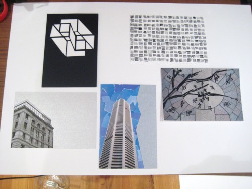
My designer postcard collection :)


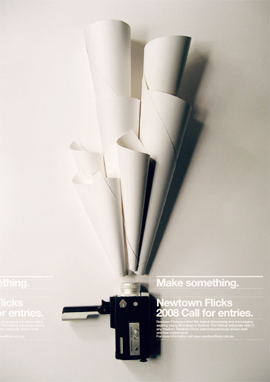
Once again, a stunning example of graphic design in poster form … amazing!


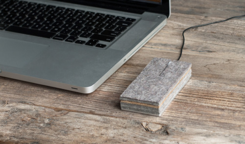
This is just lovely, a wool felt, teak and aluminium computer mouse designed by Joey Roth … combining raw, unfinished materials with the bare essentials of modern day technology


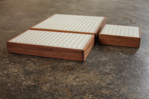
I have a real thing for good graphic design and design in publishing … this is just fantastic! The engraved text adds a lovely depth and another textural level to the overall composition :)


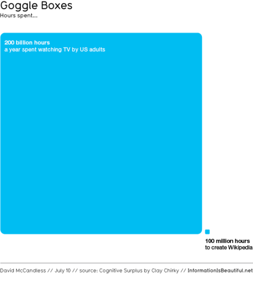
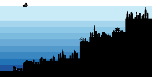
The images above are some of my favourite information maps, straight from “informationisbeautiful.net” - a really fantastic website I was looking through earlier, and a great source for ideas and inspiration … some of the designs are truly brilliant in terms of layout and legibility, and have most definitely been influenced by a designer’s hand. 

Friday 15 April 2011


I’m a huge fan of Achille Castiglione’s “Lampadina,” sold through Flos, and have been for some time. It’s a beautiful design that captures the bare essentials of what a light should be and is also a celebration of the incandescent bulb, producing a warm dispersed glow through a frosted peak


Light Tray by Daniel Rybakken and Andreas Engesvik


Really beautiful … Tom&Jerry by Konstantine Grcic


Jamie Hayon design for Baccarat, displayed @ 2011 Salone de Mobile


“One Shelves” by Studio Juju is a perfect example of stripping an object or concept down to its bare essentials, where beauty is a partnership between the compartment - type ordering of objects and the pencil thin, unobtrusive walls of shelving units  

Wednesday 6 April 2011


Model Magic

It was fantastic to see everyone’s designer displays this morning! The models were really great, and it was interesting to see how far we had all come as a group from the very first poster we designed.


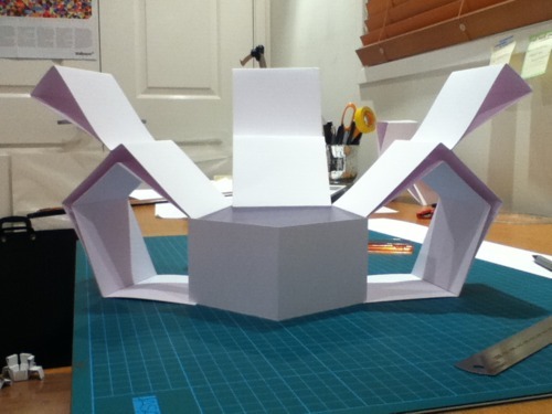
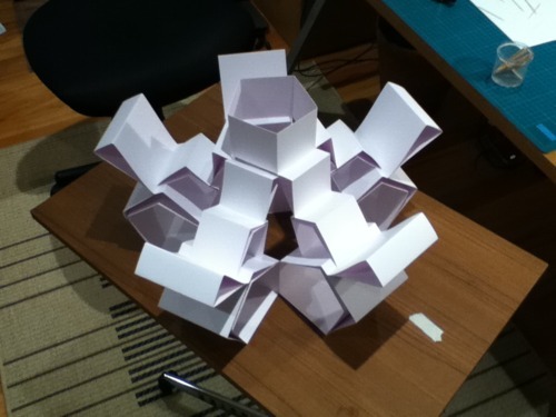
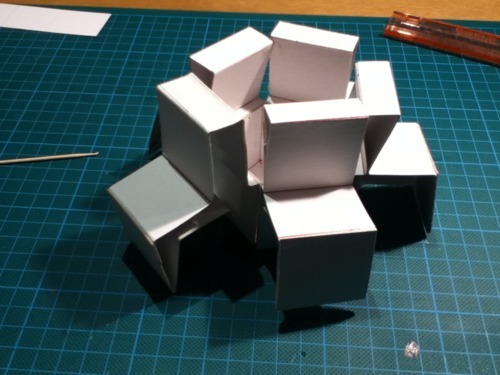
Below are a few images of my own model.
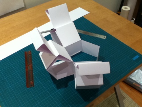


Testing and experimentation on scrap card:


Wednesday 30 March 2011